A research-led redesign of Rover's dashboard and search experience — reducing booking friction, surfacing pet updates, and introducing Pet Tracker as a new feature validated through two rounds of tree testing and remote usability sessions.
Rover.com connects pet owners with trusted sitters and dog walkers. The service itself was well-regarded — sitters were getting five-star reviews — but the platform experience was consistently criticised. Users struggled to navigate it confidently, and the post-booking experience left them with no visibility into how their pet was doing.
This is a research-led redesign focused on three areas: the search and discovery experience, the dashboard, and Pet Tracker — a new feature proposed and validated entirely through user data. It also included a complete UX writing layer covering voice, tone and microcopy standards.
Rover's core tension: a trusted service with an experience that undermined that trust. The anxiety didn't end at checkout — it started there.
- Confused by navigation on first visit — 8 out of 13 users
- Had to open sitter profiles one by one — no quick comparison
- Filters buried and unused — 10 out of 13 didn't use them
- Dashboard mixed bookings with messages
- No visibility into pet status after booking
- High drop-off during search — too much cognitive load
- Users messaged multiple sitters due to lack of confidence
- Repeat customers relied on memory, not the platform
- Post-booking trust gap — owners couldn't track pet welfare
- The platform felt like it served sitters, not owners
Help pet owners find a trusted sitter with confidence — and feel reassured once their pet is in someone else's care?
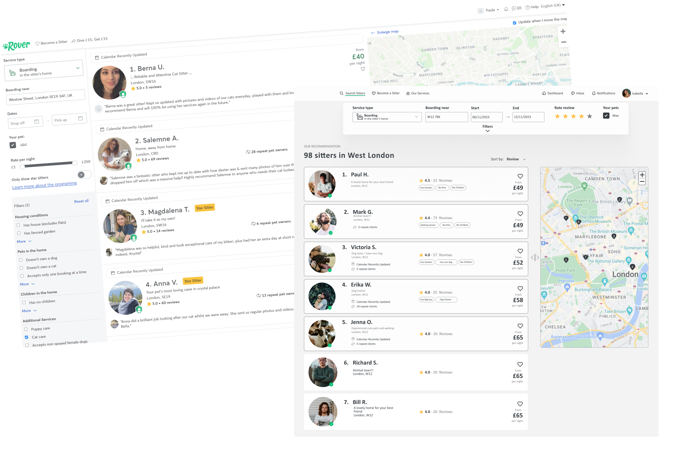
Left: original sidebar with filter overload. Right: persistent top bar filters, curated top 5 recommendations, map integrated cleanly.
The process moved through secondary research first — desk research, trend analysis, competitive benchmarking and heuristic analysis — before moving to primary research with actual users. The goal was to understand not just what was broken, but why users behaved the way they did.
Competitive benchmarking
I analysed Rover against Pawshake and Gudog across three dimensions: vocabulary, UI design and navigability. Rover scored well on familiarity but fell short on information hierarchy and search clarity.
| Dimension | Rover | Pawshake | Gudog |
|---|---|---|---|
| Vocabulary | Clear for search, breaks down in booking flow | Consistent, minor errors | Understandable but function labels unclear |
| UI Design | Dashboard too minimal — omits key elements | Balanced, nothing critical missing | Cluttered search, buttons hard to identify |
| Steps to register | 2 | 2 | 1 |
| Steps to book | 5 | 5 | 5 |
Heuristic analysis — Nielsen's 10 principles
Applied Nielsen's heuristics to the existing Rover interface. Six principles passed, four failed — the failures all pointed to the same cluster: the user had too little control and too little feedback at critical moments.
Survey — 13 users, 18 questions
80% women, 20% men, ages 30–50. All pet owners. The data confirmed what the heuristic analysis suggested — navigation and trust were the two dominant friction points.
User persona — Isabella
The research converged on a clear primary user. Isabella — 34, project manager in London, solo pet owner. Her frustration starts at search (opening profiles one by one, no review filter) and peaks post-booking when she has no visibility into Max's day. The journey map showed her emotional low point at step 7 — waiting for updates that never came.
Journey map — Isabella
Isabella has a work trip planned and needs to leave Max in the care of a kind, responsible person for a week. Goal: quickly find a sitter who meets her requirements and ensure clear communication throughout.
Prioritisation — FVD matrix
With the problem space mapped, I ran a Feasibility / Viability / Desirability matrix across all proposed improvements. Three priorities emerged at the intersection of high user value and high implementation feasibility: Pet Tracker, dashboard restructure and search optimisation. These became the core of the redesign.
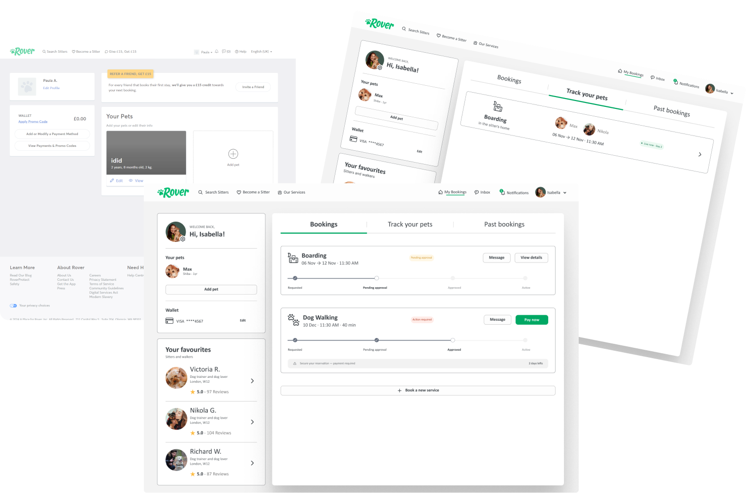
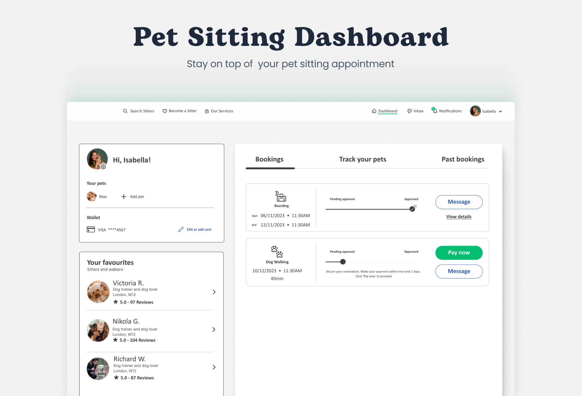
Original: bookings buried in a cluttered single view. Redesigned: clear tabs — Bookings, Track your pets, Past bookings — with status and actions visible at a glance.
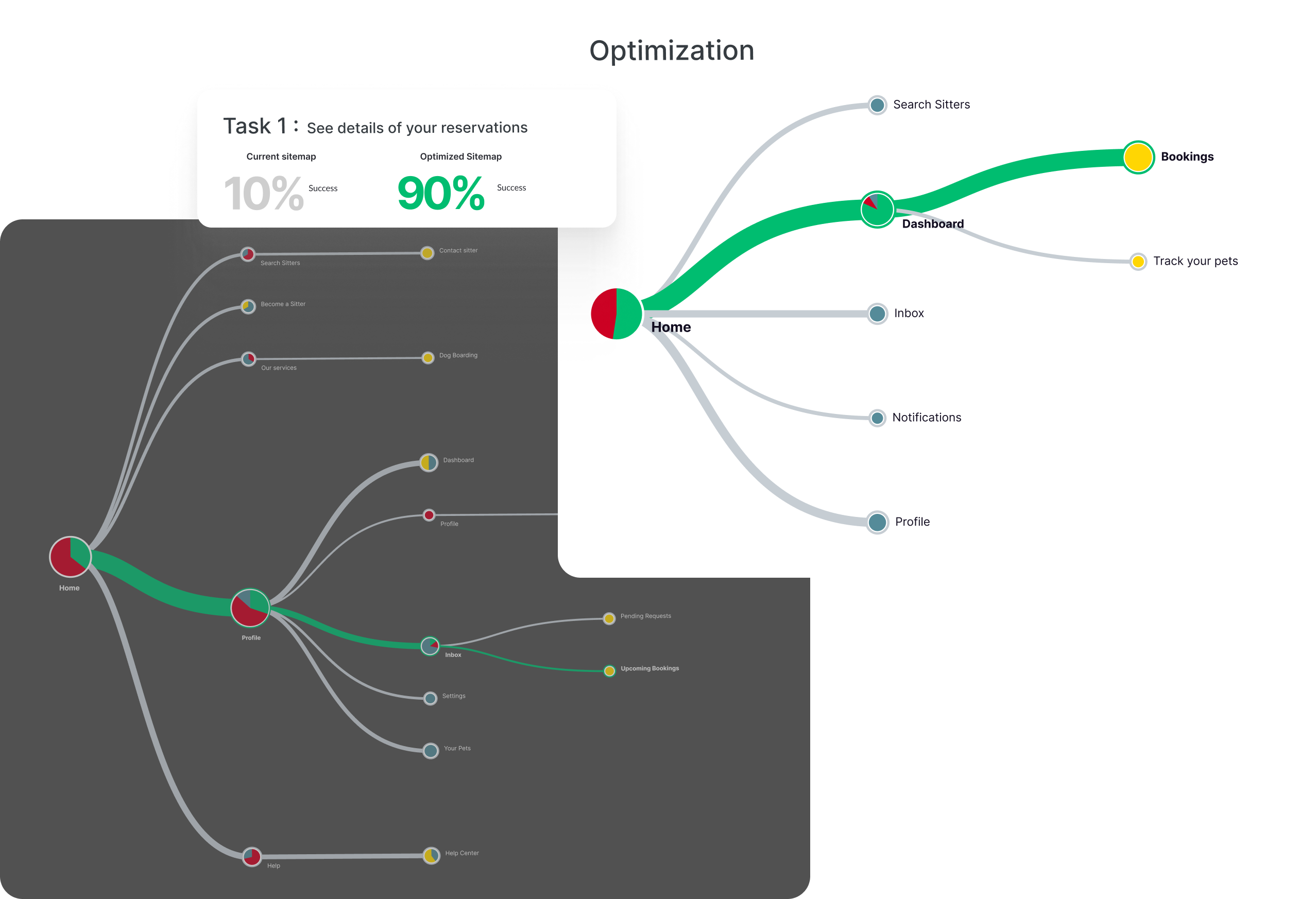
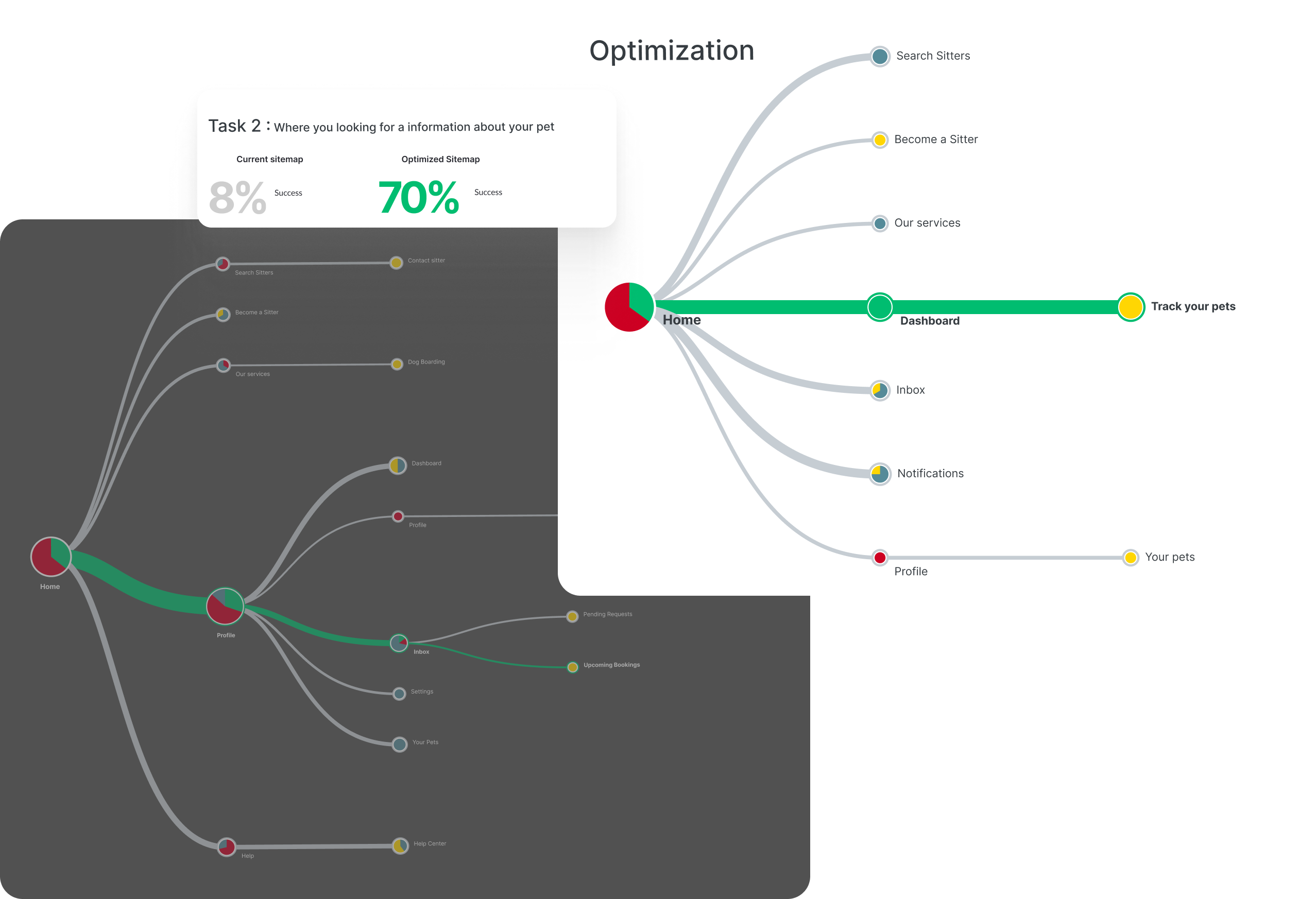
Tree testing on the existing IA revealed a critical structural failure: only 8% of users reached bookings through the correct path, and "Track your pets" didn't exist as a concept at all. The root cause wasn't visual — it was structural. The dashboard wasn't organised around what users actually needed after booking.
Wireflows
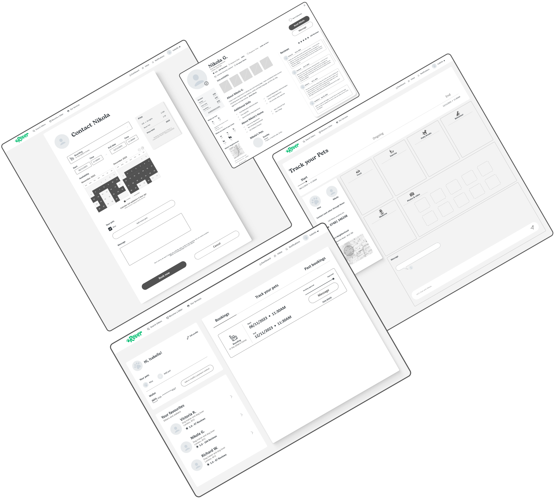
Before moving to high-fidelity, I mapped the two primary tasks through wireflows — connecting screens to user decisions and validating the restructured IA before building the UI.
Four decisions defined the redesign. Each came directly from the data — not intuition.
10/13 survey users didn't use filters — they were buried in a sidebar. Moving them to a persistent top bar made them visible from the first interaction, without competing with the results list for space.
Users felt overwhelmed opening profiles one by one. A curated "Our recommendation" block with 5 pre-ranked sitters — ordered by rating, availability and match — reduced decision load and gave a clear starting point without eliminating choice.
The original dashboard conflated two different mental models: managing reservations and communicating with sitters. Separating them into clear tabs — Bookings, Track your pets, Past bookings — made each section immediately scannable and purposeful.
Post-booking anxiety was the most common frustration across surveys, reviews and testing. Pet Tracker activates when a booking starts: the sitter logs food, exercise, potty breaks, medicine and photos daily. Owners see a live timeline from the dashboard. Users described it as the feature they didn't know they needed. 98% acceptance in testing.
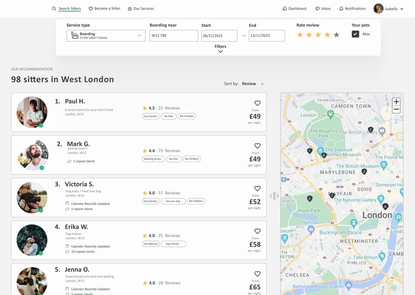
Filters in the top bar, visible from first interaction. Top 5 recommendations ranked by review. Map integrated alongside results — not competing with them.
When a booking is active, sitters log daily updates — food portions, exercise, potty breaks, medicine and photos. Owners see a live timeline from the dashboard without needing to message the sitter directly. The feature closes the post-booking trust gap that surveys and reviews consistently identified.
A platform that handles someone's pet can't afford ambiguous or generic copy. The tone needed to shift depending on context — warm and empathetic during discovery, clear and direct at high-stakes moments like payment and booking confirmation.
I defined a complete writing system: a voice and tone matrix across three brand values (Empathy, Trust, Security), a tone spectrum mapped to the user journey, and a style guide covering every component type.
Tone spectrum across the user journey
The tone shifts from inspirational and friendly during search and sitter contact — where users need to feel reassured — to serious and direct at login, booking and payment — where clarity and accuracy matter most.
Style guide — examples
- HIRE A DOG WALKER
- Click to pay
- ENTER TEXT HERE
- Error / Could not load
- You booked!
- Find trusted pet sitters near you
- Pay now
- Write a message to Nikola
- Please enter a valid email address
- Your booking for Max is confirmed
Two rounds of testing validated the redesign. Round 1 — Zoom, 5 existing Rover users — tested the prototype against the two primary tasks. Round 2 — Maze, 12 non-users — validated whether first-time visitors could navigate the restructured IA without prior knowledge of the platform.
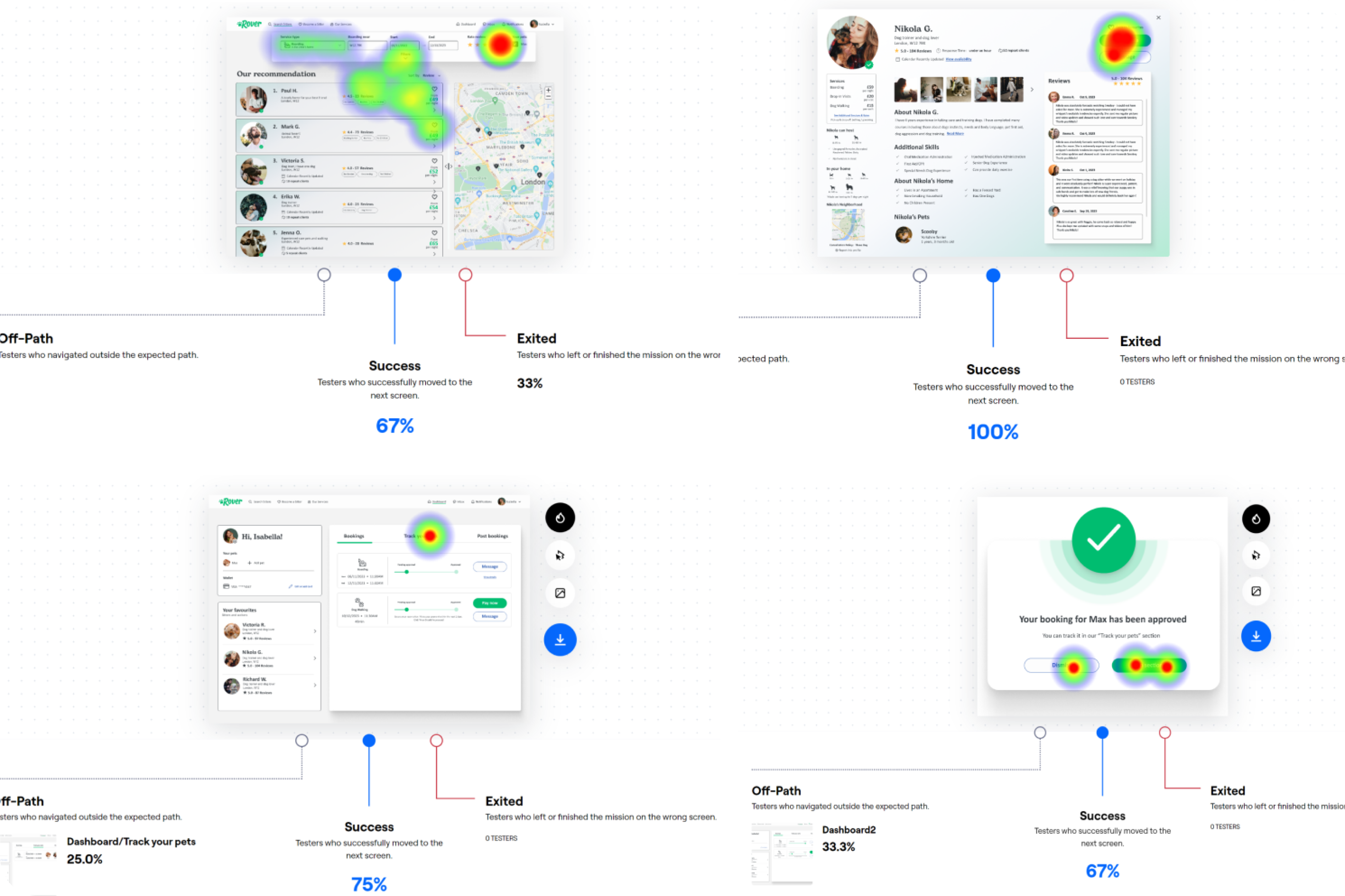
- Finding sitter profiles — easy, no major navigation issues
- Dashboard booking view — immediately understood
- Message access — felt well-controlled
- Pet Tracker found in under 20 seconds on average
- Sitter profile card info — some details still unclear
- Guide text in home search bar — needs more direction
- Button organisation in bookings — some confusion remained