Redesigning a web-based platform into an AI-driven mobile app — reducing friction and making personalisation visible to the user.
Mila AI had a real problem: the AI was working, but nobody could see it. Users navigated through multiple menus to reach a single lesson, lost their place constantly, and had no sense the product was adapting to them. The tech was there. The experience wasn't.
I led the end-to-end UX and UI for the iOS app — rethinking how progression, personalisation and continuity should work for someone learning on their phone in short, on-the-go sessions.
- Multiple menus to reach a single lesson
- No learning roadmap or visible progression
- Users lost context after every interruption
- AI personalisation completely invisible to users
- UI designed for desktop, not mobile sessions
- One tap to resume where you left off
- Clear learning roadmap with visible progress
- Personalised onboarding from first launch
- AI adaptation surfaced as a visible feature
- Experience built for short, interrupted sessions
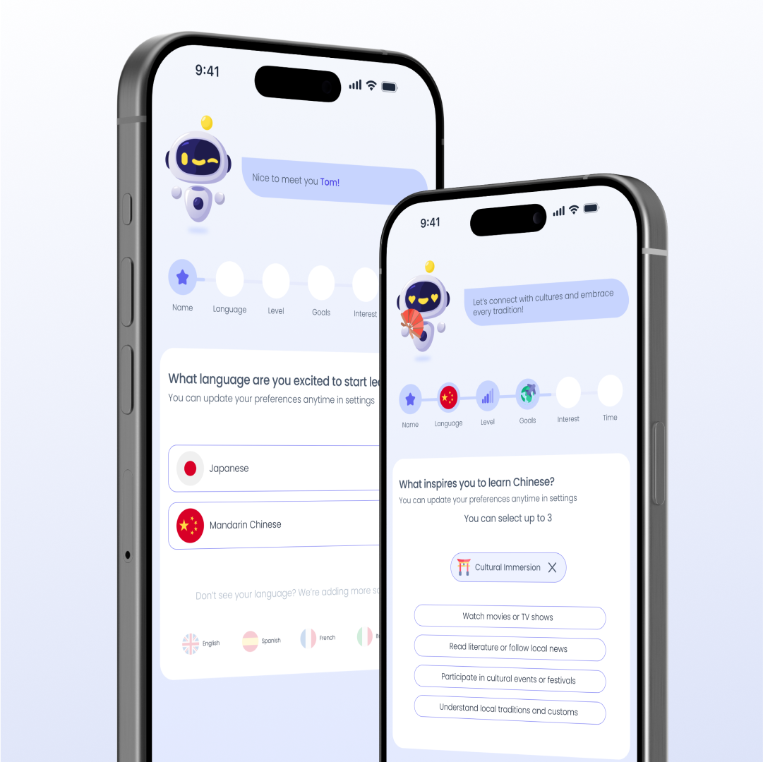
Users define goals, level and target language on first launch. The system adapts immediately — AI goes from a hidden backend process to a visible feature users can see and trust from day one.
Rebuilt the IA around quick access and clear progression. Fewer steps to the lesson, a clearer sense of where you are in your journey.
Users define goals and level on first launch. The system adapts immediately — creating ownership and demonstrating AI value from the very first session.
A dynamic roadmap unlocks based on progress — turning AI adaptation from a backend process into something the user can see, feel and trust.
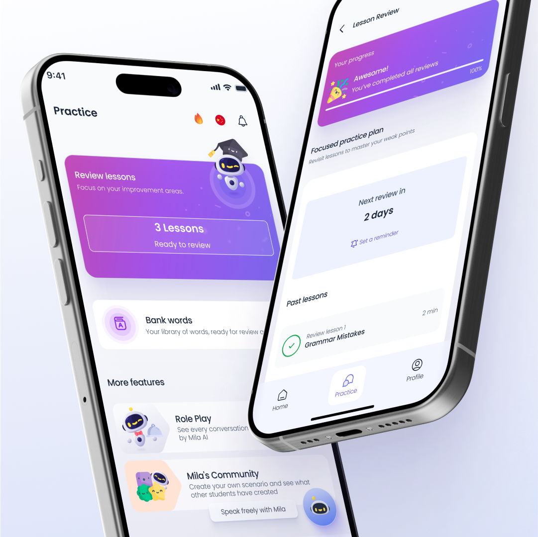
Progress saves automatically. "Continue Learning" is the primary action on every return. Users re-enter without losing context — one tap to resume.
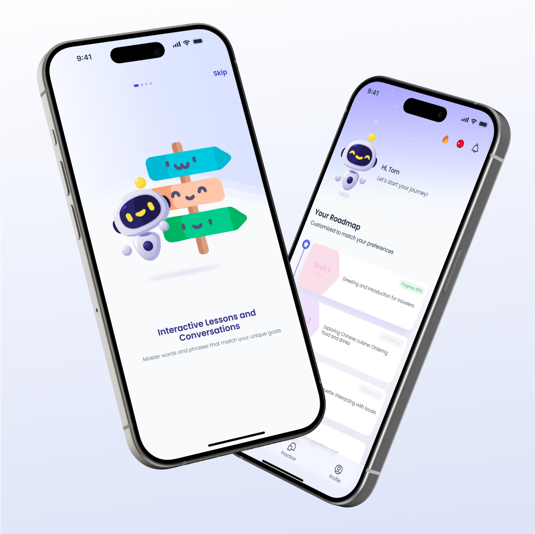
A dynamic roadmap unlocks content based on performance. Users can finally see where they are, what they've completed, and what's next — making progression tangible and motivating return.
Building an AI-powered product?
Making AI feel useful and visible to non-technical users is one of the hardest UX challenges. It's one I specialise in.
Let's talk